In this Responsive Web Design Certification, you’ll learn the languages that developers use to build webpages: HTML (Hypertext Markup Language) for content, and CSS (Cascading Style Sheets) for design.
First, you’ll build a cat photo app to learn the basics of HTML and CSS. Later, you’ll learn modern techniques like CSS variables by building a penguin, and best practices for accessibility by building a quiz site.
Finally, you’ll learn how to make webpages that respond to different screen sizes by building a photo gallery with Flexbox, and a magazine article layout with CSS Grid.
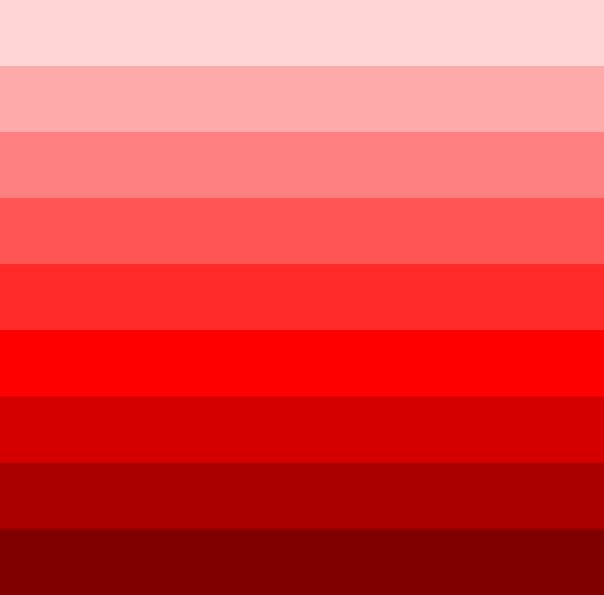
Create a color scheme that defines your website’s branding.
Use colors to evoke the emotions and perceptions that align with your goals.
Choose colors with enough contrast to make your website accessible for everyone.
Use color to highlight important elements of your website, like buttons.
Use color consistently and use it to create a visual hierarchy.
Color Theory is a core aspect of design. By understanding color psychology, harmonies, and accessibility, you can create effective designs, evoke emotions, and enhance user experience.
<link rel="stylesheet" href="styles.css" /><h1>This is a heading.</h1><p>This is a paragraph.</p>h1 { color: #FF5733; /* A reddish-orange color */}p { background-color: #4CAF50; /* A shade of green */}
In the first case, FF5733 is a reddish-orange color. Here’s the breakdown:
FF is the highest value for red (fully saturated).
57 is a moderate amount of green.
33 is a small amount of blue.
In the second case, 4CAF50 is a shade of green:
4C is a low value for red.
AF is a strong value for green.
50 is a moderate value for blue.


